BySavitha Hira
Radiatingwarmth and cheer, exhilaration and excitement, as much dynamism as a touch ofwhimsy... tones of ‘red’ and ‘burnt orange’ set the cue for 2012 – promising ayear of individuality and self-belief; opening up a world of possibilities thatmight just augment innovative breakthroughs and inspire industry crossovers...
Everyyear, we have the experts forecast colour trends that then take over our sensesplaying with seasonal sessions across product ranges, be it fashion, interiordecor, consumer goods and the like. Colours that emanate from the fabric of ourbeing – our attitudes, our learning quotients, perceptions, awareness,preferences, moods and our underlying confidence – are chiselled intoacceptable moulds of reasoning, tying up the polarised ends of our immediateenvironments with world views.
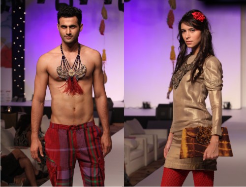
Aninteresting conversation with trend and colour analyst Latika Khosla revealsthat the thematic of year 2012 is “Possibilities”, while the personality traitthat is distinctly associated with it is “Individuality”. Latika reiterates theforecasts of leading research and trend organizations Pantone, Akzo Nobel andthe National Colour System (NCS), informing us that the colours for 2012 aretones of Red and Burnt Orange. These hues extend from one end of the spectrum,being ‘corally’, glassy and soft-toned, dominated as they are by feminity,beauty and innate subtlety, and can be combined easily with softer colours assignificant accentuating elements; to the other end of the spectrum, where theycould be glossy and team up to effect stark and strident moods.
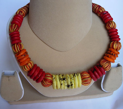 |
ImageSource: jewellerynfashion.com
|
“It also encourages us to combinematerials and colours in very new, unexpected and satisfyingways. Both, from the actual world around us and from what is in ourimagination, whimsical and dynamic red undertones along with its earthy paletterange can be used in smaller dozes as well as larger proportions,” informsLatika.
Working with the personality traits and inherent characteristics thatshape attitudes and effect lifestyles, Latika explains that the focus is on adominant ‘comfort factor’ that prevails in almost every action and lifestyle ofan individual. Consequently, the onus of being oneself is as much on ‘well-informeddecision-making’ as it is on being a part of a larger peoples group, yetstanding out in the same circle. This then substantiates one’s preferences thatgo beyond accepting a trend as is; and instead, adding on to it to make apersonal statement viz., adding on a stylish sash or a hair-piece to an ‘in’outfit or arranging a set of old pots and pans together with some freshseasonal flowers for an impromptu fashionable art installation during a party…
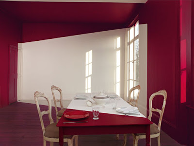
Image Courtesy:Akzo Nobel
|
Incidentally, the generic belief thatfashion inspires other design disciplines is vetoed by Latika. She feels thatfashion is actually pulling crossovers and taking inspiration from automotives,from cell phone designs, massive cues from interior design, where the emphasisis on play of materials and products and the like.
Sushmita Sen, Shantanu & Nikhil at India Resort Fashion Week2011
|
Model in James Ferreira Outfit atIndia Resort Fashion Week 2011
|
And what is the mainstay of our colours for 2012? Is it texture, material,pattern or hue? “A refined tactile quality,” responds Latika. “With mattwinning over glossy in the current scenario, a new luxury will evolve that willbe artistically combined with elegance to effect understated style rather thanin-the-face bling. The finish will dominate in tune with urbaneness and the huewill slide on the gradient - from buoyancy to restraint – but alwaysindividualistic.

A few years ago I found out about a group of people who call themselves Industry leaders get together and set what colors will be used that year. What palette of colors. It makes sense when you think about it. Why get caught making a few tons of blue when brown is in that year. Back in the 70s every other car was dark green. Back in the late 80s you couldn't find a dark green car. I checked at that time.
ReplyDeleteThis is one reason I choose the colors I do.
Posted by Dan on linkedin Group: Fine Artists.
I do love lot of colors ...... All colors ...
ReplyDeletePosted by joseph on linkedin Group: ART Professionals Worldwide.
Very interesting and food for thought
ReplyDeletePosted by Daniel S on linkedin Group: Fine Artists.
I am inspired. Just working on 2 photoshoots for Autumn Winter 2012. Thank you so much for sharing.
ReplyDeletePosted by Lorraine on linkedin Group: Mudpie - Fashion, Trends & Culture - Graphics, Textiles & Colour for Apparel, Active Sports & Denim.
Great read. Fashion definitely gets it inspiration from the automobile industry. I have connections to the automotive manufacturing industry and the color trends for vehicle and apparel are always similar as seen in showrooms and runways.
ReplyDeletePosted by Bonnie on linkedin Group: Mudpie - Fashion, Trends & Culture - Graphics, Textiles & Colour for Apparel, Active Sports & Denim.
I have done quite a bit of research on automotive industry as of late...What I found out was, that the opposite was true. Numerous Color and Trim designers told me that they definitely look into fashion/footwear world to be inspired...since fashion is so much faster than automotive. Automotive industry tends to be more conservative in general. Just an observation.
ReplyDeletePosted by Victoria on linkedin Group: Mudpie - Fashion, Trends & Culture - Graphics, Textiles & Colour for Apparel, Active Sports & Denim.